
The big colour debate: gold/white or blue/black?
99% of my Facebook feed last night consisted of arguments about the colour of one (terribly over-exposed photograph of a) dress.

Personally, I can only see white and gold. I see no black at all. But a little editing shows why people can see it both ways…

On the left, I only see white and gold. On the right, I see black and blue. In the middle, the original, I now see a similarity between both left and right pictures. Basically, it is all about perception – and this is why I find colour so fascinating.
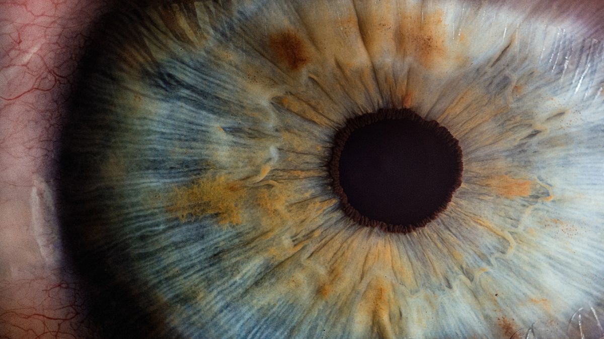
My other half is colour blind. I really enjoy this, and often ask him what colours he sees when I’m working on a project. It’s easy to forget that most people will see a different version to you. How much of this is ‘taste’ and how much is ‘perception’ I have no idea. When deciding on paint colours in B&Q, after much disagreement, he jokingly put forth the idea that maybe we both like the same colour, we just see them differently.
This could well be the case. It is not beyond the realms of possibility. Throw into the mix that there are different types of colour blindness and it becomes increasingly impossible to know just what another person sees.

(wearecolorblind.com) - they also have some fantastic resources and tips for designing for accessibility so take a look around.
So where does this leave us from a design point-of-view?
Well, you will generally know if you see things differently to everyone else. I will always remember back in art college, an ex-student working as a children’s book illustrator came back to show us his work. He was colour-blind, and his work was extraordinary. It had a palette that was subtle and unique in a way that I would struggle to reproduce. He had to have some input with his colour choices though, if I remember rightly.
There is, and will always be, a collaborative effort in the best design work. Design is about creating for somebody else, and we all know that beauty is in the eye of the beholder.
Your preference is just as valid as anybody else’s. Equally, if other folks see black and blue, that’s a consideration you should probably factor in!