
Web Dev: Client Vision & Competitor Analysis
The first thing I did was put together the following client specification (using a form developed by Clearleft). It highlights the main goals of the project, what the client wants to achieve from the website and some usual hints as to where to begin my research.


I started by taking a look at the client’s current web presence, screenshot below.

My first thoughts are: it is a simple, one-page information screen. The colour scheme is consistent and the images are relevant and well presented, but it needs updating. There are far too many fonts being used too.
I then looked into competitors websites, to see what they did well, and what could be improved. The screenshots below show particular elements I like about the other websites. This is including the large flat-design visuals of the SCA, and the relevant imagery/gallery styles featured in other dance school websites.

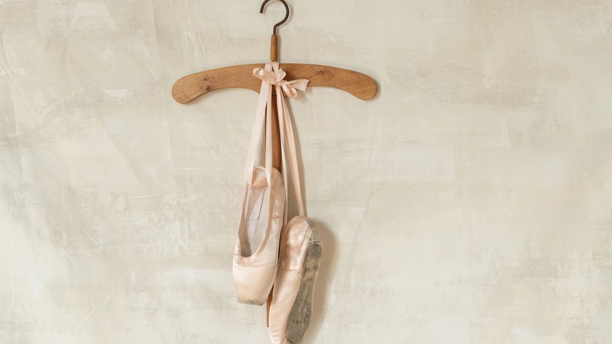
The colour seems to be an interesting one; ballet and dance is mainly associated with pink, but other colours have become more popular for dance schools setting a trend and becoming more modern. I’ll look into this more later when I research colour palettes.

I then quickly assessed a couple of these against some main usability heuristics (Jakob Nielsen), and put them in a chart below. The current website is clearly due for a complete redesign.
