Whistl unsubscribe and opt-in pages
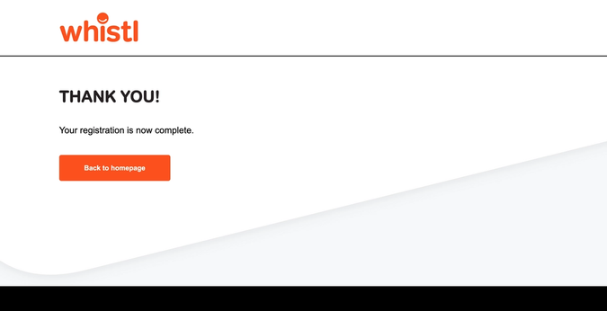
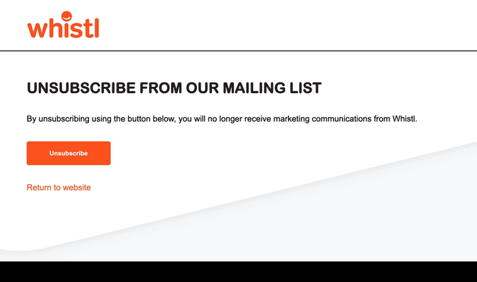
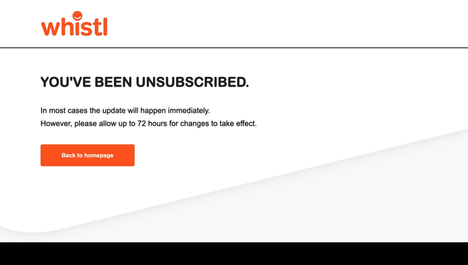
These branded landing pages were designed to be consistent with existing Whistl website.
The email opt-in and unsubscribe pages mimic their website, but cleaned up to remove unnecessary components and make use of the lovely design features such as the white/grey curve.
The colour scheme is strong - monochrome with this distinctive orange highlight. I left a lot of space for this colour and the very bold, rounded, headline fonts to breathe. It's not a difficult task to make a web page look effective with these strong design elements, as long as they are given space to breathe.


