Creative Design Lab: Contextual design week 5
Today, I presented my project and received feedback on my location-based game.
Overall, the response was positive, but there was some confusion as to where the starting point was.
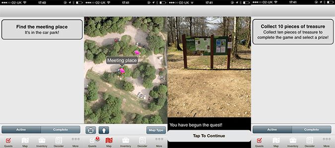
I had assumed that when the user goes to the park, as there is only one entrance, the tasks have to be completed in order. Although, I have overlooked that the user could become confused, miss sections out or just get lost. I adjusted my game according to this feedback. I added a quest (the only quest that comes up in the beginning) that directs the user to the meeting place. After the meeting place plaque is viewed, the next quest to collect ten pieces of treasure appears.
It was simple things like this that really made the presentation and testing worthwhile.
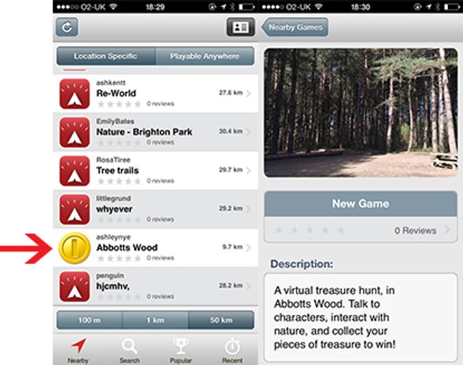
I also added a logo and splash page photo to my game, to help make it stand out from others in the list. I decided to use the coin image I’ve used throughout the game for consistency and to highlight the fact that it is a treasure hunt game.
In terms of the characters and storyline, the feedback was encouraging and I think that children would enjoy playing the game as much as I have enjoyed creating it.


