Web Dev: Client Worksheet
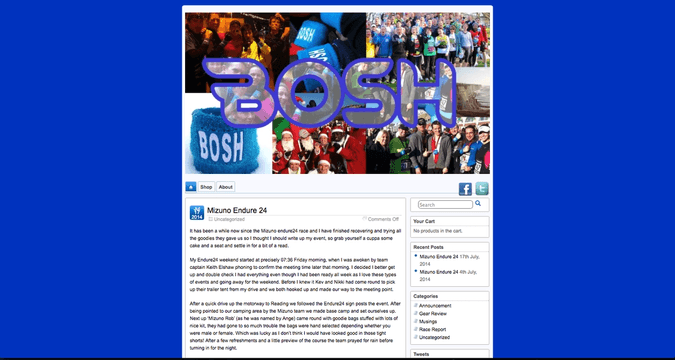
The client, BOSH (boshrun.com), requires a new website.
The first thing I did was research. Understanding the ethos of the company is vital. BOSH Run is rather unique as a running club, because it allows anyone to join and actively encourages everyone of all shapes and sizes, and all fitness levels, to learn to enjoy running as an exercise. They have one rule: be nice.
This friendly, accessible club needs a website to suit.
As a group, we conducted an informal client interview, which was highly beneficial and a great starting point for the project. The client has a vague idea of functions needed for the new site, but graphic design (bar the logo and main colour) has been left completely to us. The main points I took from the interview were that the client wants something fun and friendly looking, easy to access and navigate, and that condenses all the chunks of BOSH information into one place. Ideally, the client would like a member sign in, to allow for collecting some basic information on users and to control who posts content.
I used the information gathered in this interview, along with some research on their existing website, to produce a client-worksheet (courtesy of Clearleft). There is a lot of useful information in there, but the main points to take from this are:
- It is a social site. It needs to be accessible, easy-to-use and allow for easy communication between ‘members’.
- It will be mainly user-created content. Blog/forum based.
- Aiming not to exclude anyone. It must be inviting.
- Social media integration.
- Improve on their existing E-commerce area.
This is a great starting point to begin the project.

