Web Dev: Competitor Analysis
An expert analysis can be extremely beneficial, in addition to user research. When talking to Scott Goodwin, creator of BOSH Run, he outlined his main competitors as Watford Joggers and Fetch Everyone. I chose to analyse their websites using HCI principles, heuristics, and user-centered design.
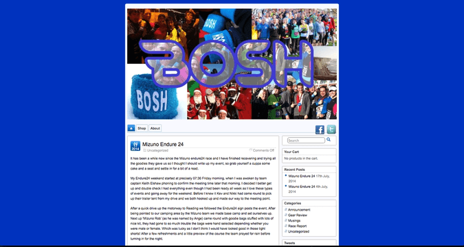
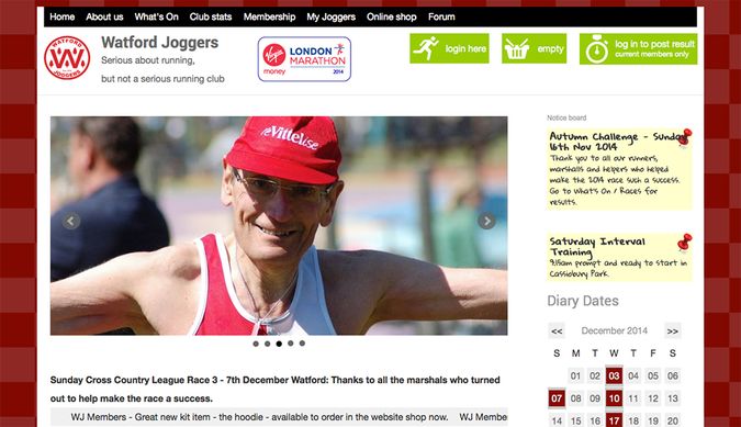
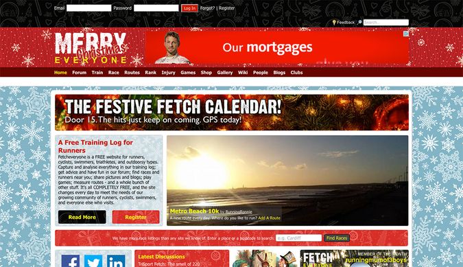
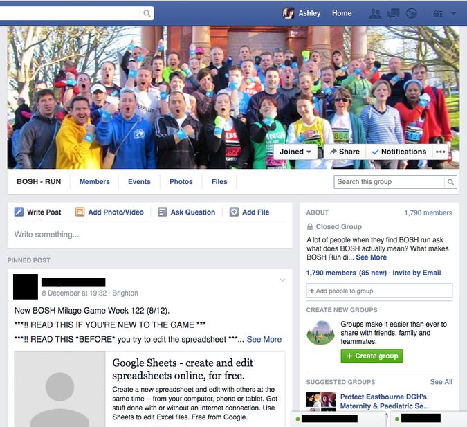
You can see an example of their website homepages below, along with BOSH’s current website.
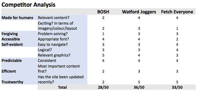
I created the following table that contains some critical comparison points, and a score out of 5 for each element. The questions are all examples of some essential design usability principles.
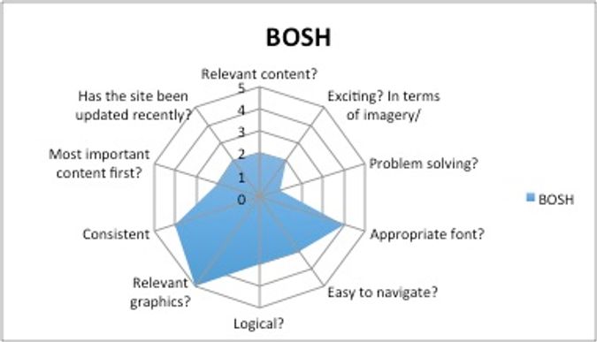
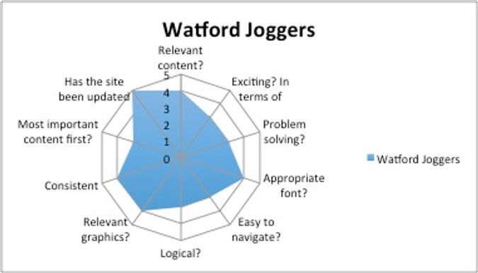
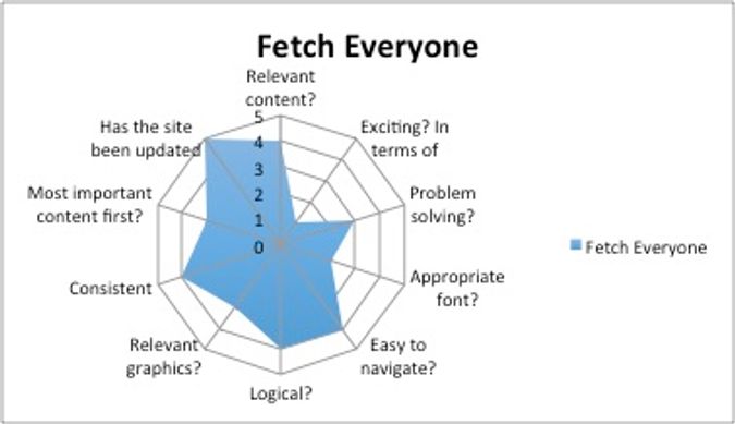
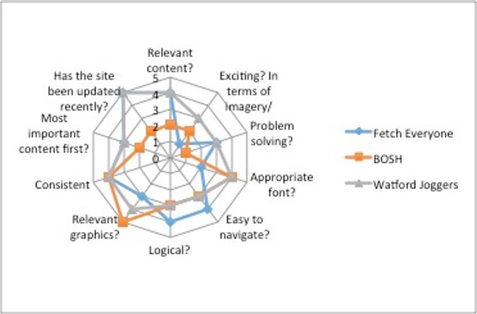
I used this data to create a series of radar charts, to visualise how well BOSH is doing against its competitors. The last chart I created is a comparison of all three.
It is evident that the current BOSH website needs work, but there are many areas for improvement on the other sites as well. The navigation is adequate but the design (particularly the graphics and overall branding) needs to be refined.
There is a very obvious difference in the amount of content on each site. Watford Joggers and Fetch both have substantially more, but this is mainly because BOSH uses Facebook primarily, and amount of user-generated content on social media is massive.
It will be important to integrate this content with the new website, transforming it into the main hub of activity for BOSH. With the appropriate tools, the members of BOSH and their contributions will allow for the new website to be one of the top running club websites in the area. Therefore, I am confident that the new BOSH website will score substantially higher on this competitor analysis board.
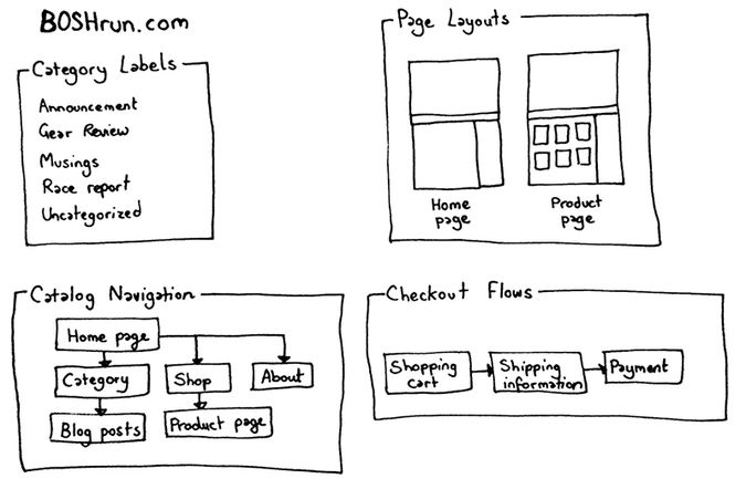
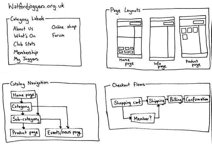
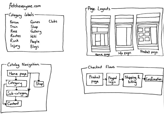
I also conducted a multi-faceted analysis of the information architecture of each site as follows:
These sketches allowed me to directly compare the page layouts of the three sites.

