Web Dev: Evaluation
Expert Review
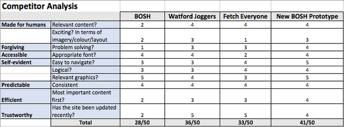
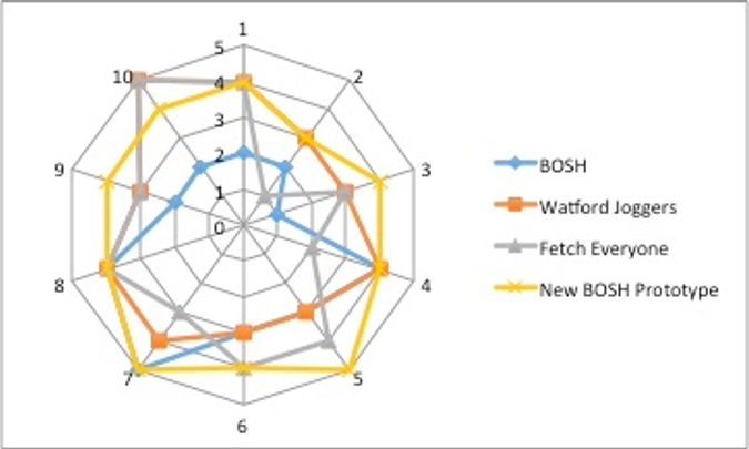
To evaluate my prototype, I added the site to the competitor analysis table I had previously used to compare the current BOSH site and two other running sites.
It is clear that the prototype is a clear improvement on the existing website, and scores better in the usability criteria than the competitors. There is room for improvement in the visual design category, to make it more exciting and stimulating visually, and this is something I would do in the next phase of the project, or if I had the opportunity to repeat this.
The reason I marked the navigation so highly, is because I designed the navigation directly from my user journeys and tested this with other people before eventually redesigning it to give me the current version. It is simple to use, and obeys principles such as only giving the user a small amount of options at any time, so as not to overwhelm them.
Cognitive Walkthrough
User input
My user is male, 22, and technologically able. He has not seen the prototype before, and has never accessed a running website either. He is, however, familiar with forums.
Tasks
I have asked him to find a running event near his hometown.
I have asked him to find a popular running event.
I have asked him to show where he could get advice about running shoes.
Correct action sequence
The user is expected to click on “Run”, then “Events Page” in the navigation bar, followed by the “Events by location” tab on the screen. Here he can enter his hometown in the search bar and navigate to an event near his hometown.
The user is then expected to click on the “By BOSH attendance” tab to show popular running events.
For the final task, the user is expected to click on “Blog” and then “Gear Reviews” in the navigation bar. Alternatively, he could use the search bar at the top of the page, or navigate to the forum, search the thread topics, or login and post his own question.
Definition of the interface
As the user hovers over the main navigation bar, subsection topics appear. These will lead the user to more specific pages, giving more description and allowing him to complete his task more efficiently.
Hovering over clickable elements also changes the cursor, allowing the user to see that it is an option to click on.
Walkthrough
The user managed to navigate to the events page effectively, as there were only 4 options on the main navigation bar and “Run” showed a subsection of “Events”. There, the user was able to find the “Events by location” tab easily, by following the labels.
The user then managed to find popular running events by clicking on the “by BOSH attendance” tab, even though the label doesn’t mention popularity. This is because the wording is clear, and is in the same section as the other event filter options, none of which relate to popularity.
The user showed more hesitancy in the last task. He first went to “Blog”, “Gear Reviews” as expected, and scrolled down to view a post about running shoes. The user didn’t try to use the search function, and stated that he would have used the forum had he not found a post about running shoes on the first page of the blog.
Evaluation Summary
I think that the competitor analysis and the walkthrough shows that the navigation is very effective. As the semantics were rewritten to try to convey more running specific terms, I think the ease of use has improved. Now, when users are faced with the tasks they want to achieve, it is very clear where they need to go to complete this.


