Web Dev: Visual Design for BOSH Prototype
I used Axure RP 7 to start designing my prototype, based on my previous research in this project, and of others including my Human-Computer Interaction and Design for Digital Media projects.
I gained a lot of experience last year with user-centred design and the techniques available to research this concept.
“As a main component of our idea is organising large quantities of information, clarity is key. Use of negative space, use of colour to simplify and legibility are three things that will be priorities in our design.” – part of my HCI report.
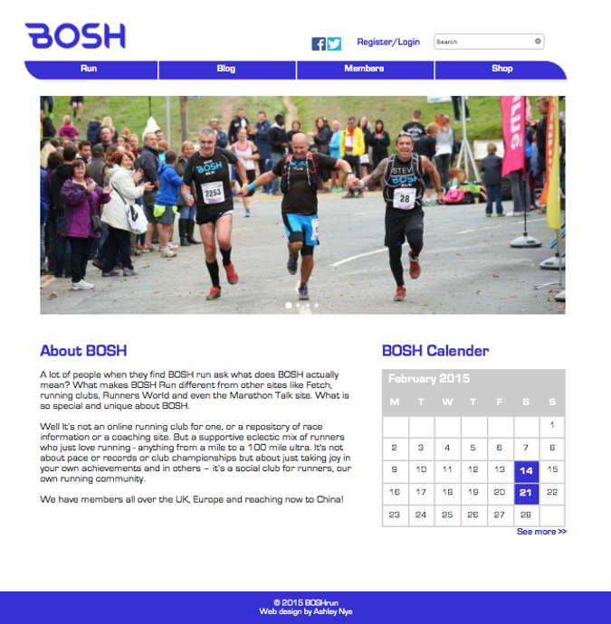
I think my work really benefits from user-centred design, and the research I’ve done previously into design principles. My first mock-up of the design is below.
I’ve used quite a minimalist approach to the design, as the negative space aids clarity. I’ve echoed the shape of the logo in the navigation bar, and kept the colour scheme minimal too. I’ve used light grey boxes to break up the page, and separate different elements.
I designed the rest of the website using the same theme and structure, for consistency and ease of use.
I referred to other successful websites for certain parts. For example, the forum page was based on elements of the hugely successful Mumsnet forum and Runners World forum.
The design is purposefully simple, because not everyone using the site will be familiar with technology, as my Personas and other research highlighted. My competitor analysis also showed that other running sites were possibly too cluttered, and were overwhelming for first time users. My research showed that first time users and new runners are a big percentage of BOSH’s target audience, so this was very important.

