Web Dev: Colour
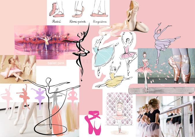
To get a feel for the site I want to create, I put together the following mood board. I think my favourite thing about it is the fluid illustrations, and the line that represents movement so effectively. I want a feeling of fun as well as elegance.
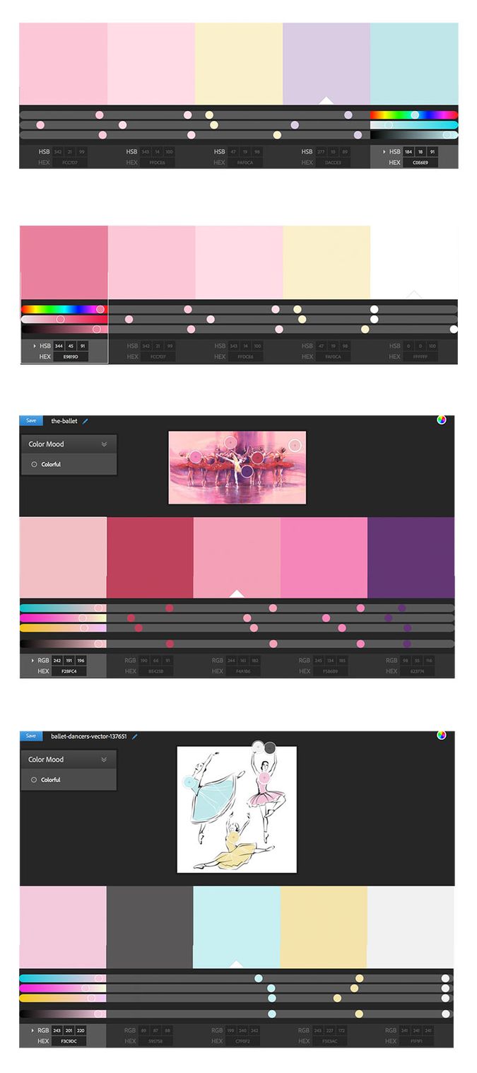
I then put together a few colour palettes, some based on my idea of ballet and some directly taken from images I found on the web. I used Adobe Kuler to do this (now Adobe Color CC). I wanted to keep quite a feminine palette, but there is research to suggest that a lot of women prefer the colour blue or a green-blue mix so this also features in my tests.
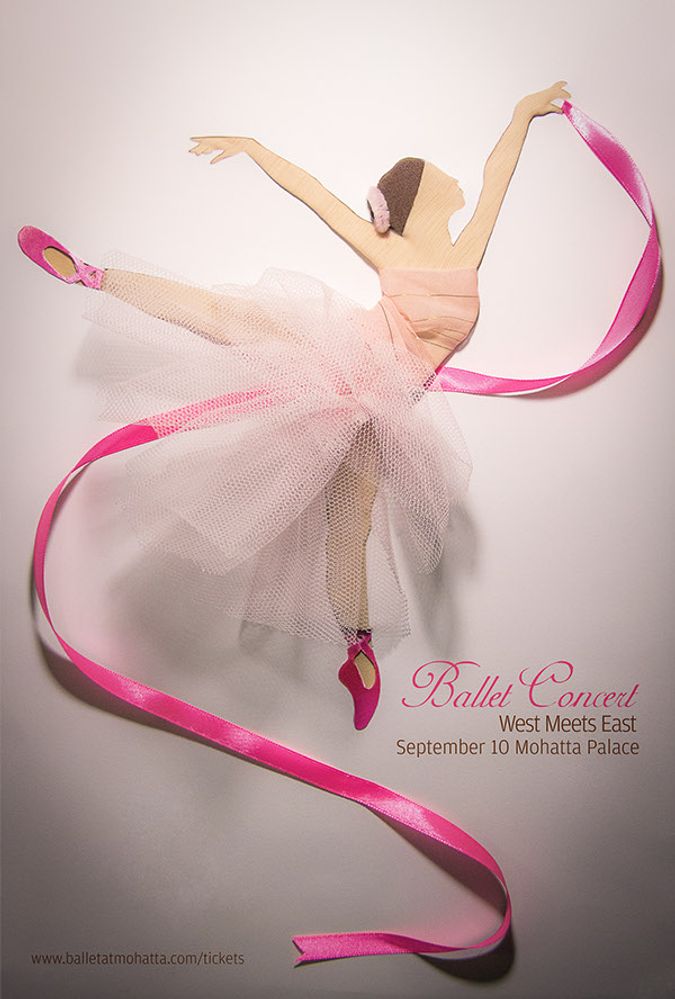
I also found this poster on Behance by Madhiya Qureshi that I think has a beautiful quality to it. Ballet and dance is all about movement and fluidity. I want to capture this in my design.
