Web Dev: Skeleton Boilerplate
I decided to experiment with Skeleton, a responsive CSS boilerplate.
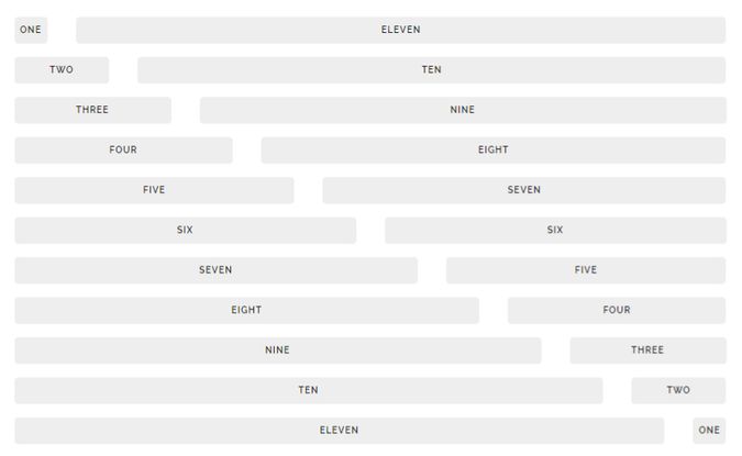
It is extremely simple to use, and comes with a 12-column grid making it a perfect fluid layout template.
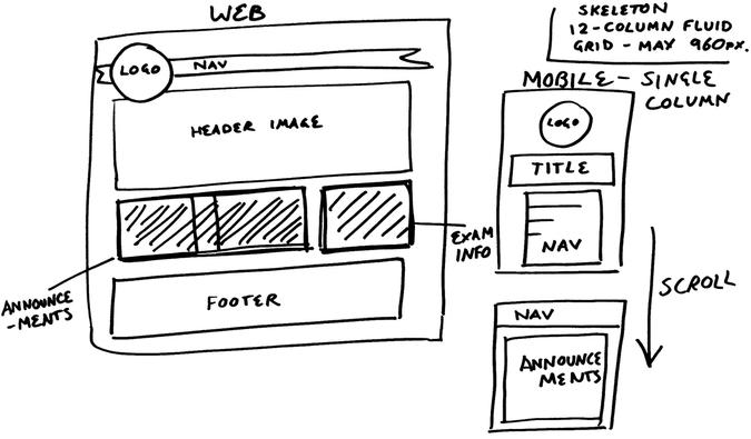
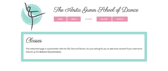
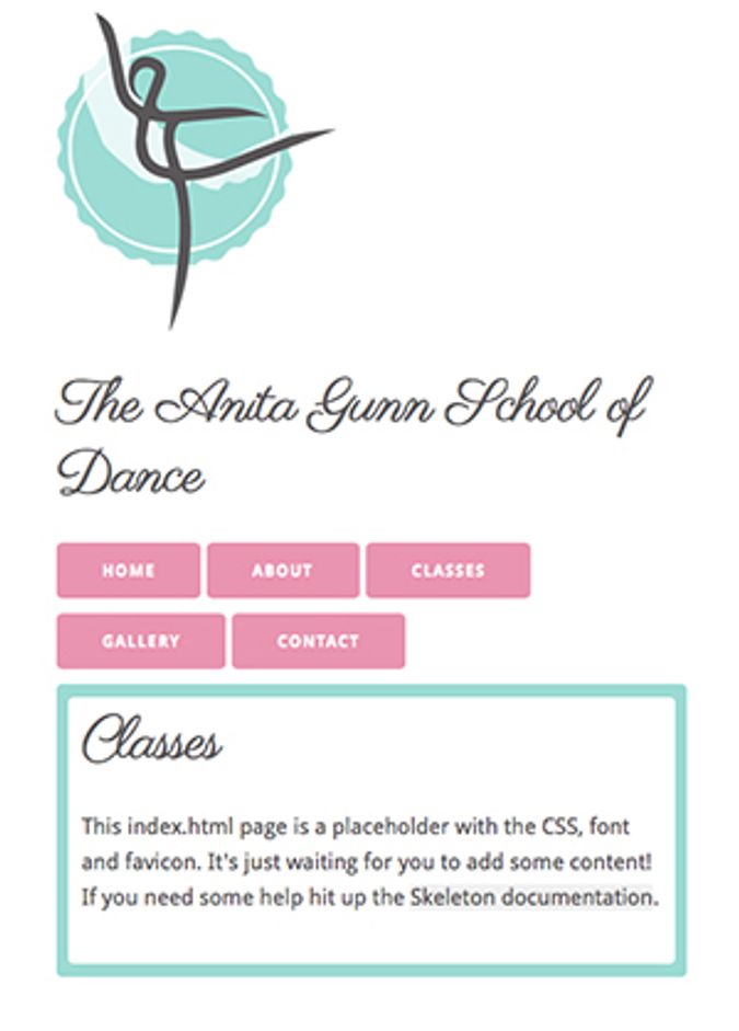
I was able to quickly put together a starting layout, based on some sketches I mapped out previously. My initial sketches are below (taking the grid layout into consideration) followed by the initial desktop layout and a mobile version created starting with Skeleton.
I developed a system of blocks, that include a ‘border’ section of colour, and a white section to hold the text. As you can see, it is an extremely quick way to get together a responsive design. I’m going to work on gathering and creating the content with the client before I progress much more with the coding, but I’m happy that this is going to be a viable tool to build on and develop further.

