Ampersand Conf 2015
“AN INSPIRING ONE-DAY EVENT FOR WEB DESIGNERS AND TYPE ENTHUSIASTS” – 2015.ampersandconf.com
This year’s Ampersand Conference lived up to the hype. Enthusiasm oozed from every speaker, and flowed into the audience like a Zapfino swash.
The inspiring talks covered everything from legibility and practical issues of font on the web to emotion and stereotypes of certain typefaces.
Marcin Wichary spoke honestly about the experience we all have at some point in design – messy solutions to problems. It’s very relatable in this industry, but he confesses he will be going to design hell for some of the hacks he’s used. The entire audience laughed with him, finding very creative solutions to unexpected issues with medium.
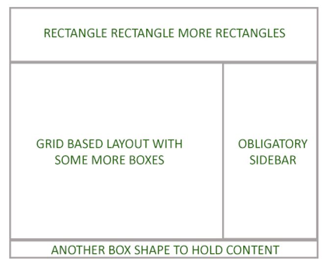
Jen Simmons urged us to break out of the rut web design has fallen into, to stop creating everything to fit inside nice boxes, and use the new technology available to us. CSS shapes, as described in this fantastic article by Sara Soueidan for A List Apart, allows us to mix imagery and content in a more organic and exciting way. Experimental magazine layout has been doing this for years and it’s about time, Jen says, for the web to catch up.
Lu Yu took us through some very interesting cultural differences and practicalities about designing for a Chinese audience. Green is seen as a negative colour in China, whereas red is lucky and has positive connotations. Also, the layout of a webpage is tricky because the direction of reading varies between the traditional top-down right-to-left columns, and the newer left-to-right in rows. There is also a huge amount of characters, making a selection of fonts, weights and variables loaded to a single page near-impossible. Researching and understanding the environment for which you are designing is crucial, and this was an eye-opening talk.
Matthew Young of Pelican books addressed the issue of e-books trying to imitate printed books, and how the design of new technologies are often based on what has gone before. This is not always beneficial to the user, instead inhibits innovation. Design should be reasoned, and as Jen Simmons pointed out earlier, that reason shouldn’t be because “we’ve always done it this way”.
Sarah Hyndman gave us insight into the wonderful world of typeface psychology and the experiments she conducts. Relating typeface to emotion, feeling and even the senses, Sarah could comfortably predict the ways the audience would interpret different fonts. We played Typeface Tinder, and chose one that we would ‘date’. She also showed us that you could manipulate the perception of sweet and sour based on font. The power of type is truly incredible – and “designers should use this power for good”. Which is lovely to hear. I’m all for ethical design, first and foremost.
This isn’t a complete list of speakers, and there was far more to experience in person. Unfortunately, you really needed to be there to benefit from the enthusiasm and feel truly inspired. Hopefully next year ampersand will be back, bigger and better than ever.
Follow @ampersandconf on Twitter to stay updated, and to view the speakers slides in the coming week.

