Font pairings - a little inspiration
Font design can be tricky - there is so much choice (too much, sometimes) and it can be really difficult to narrow down the ones that best convey the meaning behind your brand/design.
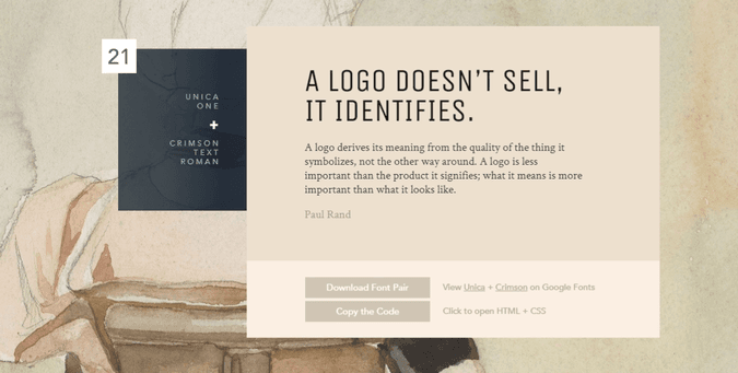
I find it easier to start with looking at font pairings for inspiration. This beautiful page of Google fonts, lovingly curated by Lou Levit, was a great source of help for me. I decided I didn't like my last choice after around a month of sitting with it, so I updated it to Unica One for headings and Crimson Text Roman for body text.
I simply imported the font and created the variable to use throughout the css modules:
// Import our fonts
@import url('https://fonts.googleapis.com/css2?family=Crimson+Text:wght@400;700&family=Unica+One&display=swap');

// Declare font variables
--font-family-heading: 'Unica One', cursive;
--font-family-body: 'Crimson Text', serif;

// Use our fonts!
title {
  font-family: var(--font-family-heading);
}
I chose this pairing because it was fun without being overly complicated. I love the heading font with it's quirky y's that look like tuning forks (a reference to creativity that defines me) and the super contrasting body text.
One of the best ways to create an exciting font paring is to go for a massive contrast. Go big or go home. It's been great fun to play with the fonts on my own blog - there's absolutely no pressure or commitment at this stage. If I decide I don't like it in a month, I only have to change 3 lines of code!
Have fun with it!

